READ MORE: Colors: Where Did They Go? An Investigation. (Vox)
Is it true that many movies and TV shows made now look gray, washed out or plain dull? That’s the contention of Vox critic Emily VanDerWerff, who undermines her own argument every step of the way.
Her contention is that “many TV shows and movies now have a dull filter applied to every scene, one that cuts away vibrancy and trends toward a boring sameness.”
She agrees with the characterization of this look as “intangible sludge,” in a comparison of the original 2006 show Dexter and the latest 2021 Dexter series that underlines a shift from colorful imagery to “a shadowy blandness [that] coats everything.”
for an explicit example of how the Intangible Sludge has become standardized, look no further than a season 1 dexter screencap & a dexter: new blood screencap (pls do not @ me with “but he’s not in miami anymore”) pic.twitter.com/3ubAZCI32Z
— Katie Stebbins (@_katiestebbins_) November 18, 2021
VanDerWerff correctly identifies that the more technical term for the slightly washed-out appearance is “desaturated,” and recognizes that this is not in and of itself bad. “It’s a tool that can be used poorly or used well… But why is it everywhere now?” she asks, “What is behind the endless desaturation of Hollywood?”
READ MORE: Colors: Where Did They Go? An Investigation. (Vox)
Hollywood’s Grayscale Renaissance
Whether or not VanDerWerff is right on the merits, she may be onto something about the facts surrounding desaturation trends. Hollywood has had a love affair with films that break out of the color mold.
“2021 can be seen as a climax to a grayscale renaissance that’s been happening for well over a decade,” USC Cinematic Arts prof Luci Marzola writes for IndieWire. “Nine black-and-white films have been nominated for Best Cinematography by the Academy in the last 20 years. That’s more than half of the 16 total since the Academy eliminated separate categories for black-and-white and color cinematography in 1967.”
READ MORE: The History of Black-and-White Cinematography: From Its Death to Latest Oscar Trend (IndieWire)
ALSO ON NAB AMPLIFY
I don’t know what shows she is watching or quite how a critic can misunderstand the fundamentals of look design within cinematography, production design, costume and color grading, but if we take just some of the frontrunners for Best Film this year: Dune, Belfast and The Power of the Dog, we can agree might fit into the “intangible sludge” syndrome.
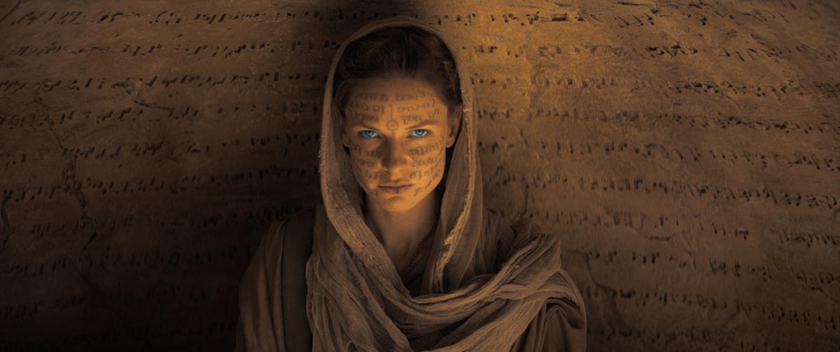
Dune is colored like the desert and given somber tones as befitting an epic story about imperial warfare. No one is complaining. It’s likely to be high up in the craft nominations come Oscar time.
ALSO ON NAB AMPLIFY
Likewise having eye-catching color in Jane Campion’s western would only distract from the core drama, a point emphasized by the film’s DP, Ari Wegner.

ALSO ON NAB AMPLIFY
It’s not only feature films that use desaturation to great effect.
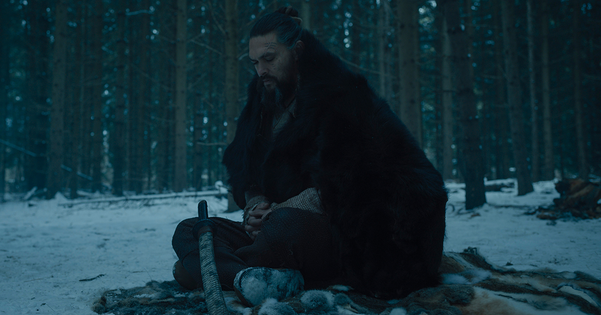
Raised by Wolves (season two debuts this month) is a sci-fi HBOMax original that uses a subdued palette to show the difficulty of life on Kepler–22b.
For season one, colorist Stephen Nakamura told Company3 that they chose to “pull the color out of things and leave a lot of the shots almost monochrome”
For a more standard approach to drawing focus, Nakamura explains, “You might have cold background and then a character whose face is a little warmer and that pulls your eye to the face,” he says. “But in a black-and-white movie, or something like this that’s almost black-and-white, we’ll make the background a little darker than we probably would in color, and maybe make the face a little lighter to build up the contrast that way.”
READ MORE: Lonely Planet: Senior Colorist Stephen Nakamura on ‘Raised by Wolves’ (Company3)
In season two, the characters have migrated to the tropical zone of Kepler–22b, an area of the planet that is richer in resources. To emphasize this,
Black and White and Dramatic All Over
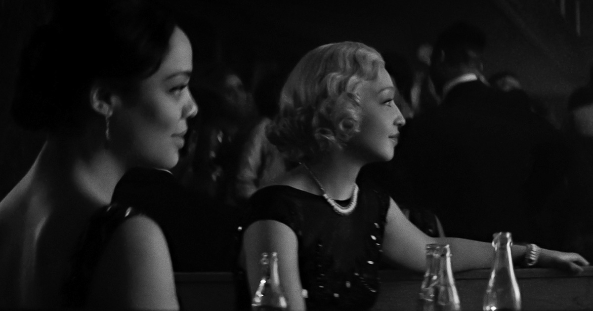
Black-and-white dramas such as Kenneth Branagh’s Belfast and Joel Coen’s MacBeth are also getting warm praise. Fair enough, as Vox doesn’t seem to lump monochrome aesthetic choices in with its argument, although these would fit with its contention that dull colors lends a story a more serious look and feel (VanDerWerff looks back to The Godfather to back this up).
Belfast, however, uses color in an extraordinary way to illuminate the young Branagh’s inspiration at the theater and picture house watching Chitty Chitty Bang Bang.
Saturated Color Is Alive and Inventive
Other 2022 hot awards contenders like Licorice Pizza have a Technicolor vibe to mimic the early seventies, or, in the case of Last Night in Soho, a hyper-vivid fluorescence to convey the swinging sixties and a deranged state of mind.
King Richard, the highly entertaining look at the rise of tennis’s Williams sisters, is definitely not a desaturated film. It has whites and yellows and blues and is primarily filmed in the warmth of the California sun.
There are numerous examples which undercut the VanDerWerff thesis. No mention is made of recent animated features that — like Encanto — positively pop with primary color.
“It’s a tool that can be used poorly or used well… But why is it everywhere now? What is behind the endless desaturation of Hollywood?”
— Emily VanDerWerff, Vox
VanDerWerff recognizes this when tracing what she feels to be the consistent layering of dull color back to The Matrix in 1999. She acknowledges that the green computer overlay and monotonous beige color scheme worked for a movie about the internet and digital drudgery but says other movies then followed it without having the same story reasons for doing so.
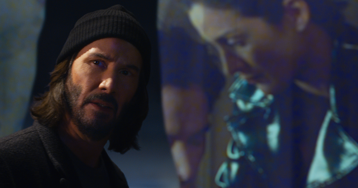
Matrix Resurrections might be a disappointing film in some respects, but not visually. It is designed to deliberately pop with primary colors in acknowledgement that our experience of the internet has become photoreal.
ALSO ON NAB AMPLIFY
VanDerWerff seems to recognize, as many DPs do, that digital cameras can lead to a consistent “video-style” image, which is why so many of them prefer to add back character with older lenses or by applying grain — or digitally altering the image. Most are skilled enough to create looks that work for the show.
Vox seems to suggest that it is the fault of the rise of digital moviemaking and by implication a laziness on the part of filmmakers why every movie and TV show — including the Marvel ones, according to them, looks the same.
Yet the same technology (as well as staples like production design, location and costume), enables creatives to apply different looks to better tell the story. If a film’s story isn’t working, it won’t just be because the color grade is poor — although it won’t help.
HDR and Consumer Tech’s Influence on the Return to Subtlety
One factor missing from the article’s arguments is that of consumer displays and, in particular, the use of high dynamic range.
HDR is not yet dominant in either home displays (most new TVs do have it, but there’s a lot of legacy kit in living rooms) or in post-production, but it can help to “lift” the “sludge” of color and contrast, shadow and highlights. As prices drop and more TV makers offer it in standard models, adoption rates will increase and more of us will be able to see a DP’s vision as they intended.
An older technology, OLED (which stands for organic light-emitting diode) or the newer QLED (quantum dot LED) also can help to explain why some people are wowed by movies and TV shows that others dismiss as poorly light or dingy. OLED displays boast brighter whites and truer blacks, and offer more nuance in between light and darkness; higher costs, burn in concerns and a shortened shelf-life are some of the drawbacks that have prevented wider uptake.
Desaturation Is a Valid Artistic Choice
Creators should take everyone’s opinions on the saturated/desaturated debate with a grain of salt. What’s right for one project may be completely wrong for one helmed by a different creative, but there are some basics to consider before finalizing a color palette.
Maggie King of PHLEARN Magazine has compiled a helpful guide to understanding achromatic (AKA black and white) vs. full color photography. It’s got backstory and best practices that apply directly to the those considering the value of desaturation in storytelling.
King writes, “to make an informed choice [between color and achromatic] you will need at least a superficial understanding of art and photographic history, color theory, and the way people think.”
READ MORE: How to Choose Between Color and Black & White (PHLEARN Magazine)
If you’d like to truly nerd out about the desaturation/grayscale debate, The Online Photographer mined a Twitter thread to get into the physics of why/why not certain editing techniques can produce highly unsatisfactory results.
Tim Soret (the author of the thread that inspired the blog’s deep dive into physics and how our eyes perceive color) is a cinematographer, tech artist and founder of Odd Tales Games.
Let’s desaturate primary colors:
— Tim Soret (@timsoret) April 19, 2020
– Red
– Green
– Blue
And secondary colors:
– Magenta (R+B)
– Yellow (R+G)
– Cyan (G+B)
The result? A uniform 50% gray. Non-sense. pic.twitter.com/CvaHst3dfm
The conversation is primarily based around Photoshop and physics, but the Hollywood #nerdfactor still applies for animators and colorists.
READ MORE: Why Desaturation Doesn’t Work: Tim Soret (The Online Photographer)
Emily M. Reigart also contributed to this article.


