All eight episodes of Netflix’s limited series, adapted from Patricia Highsmith’s novel The Talented Mr. Ripley, are directed by writer and creator Steven Zaillian, and they’re all lensed by cinematographer Robert Elswit.
“This singular vision gives Ripley both an impressive aesthetic cohesion and a radical kind of ambition,” says Vanity Fair’s David Canfield, who has the filmmakers dissect a dozen shots from the psychological thriller.
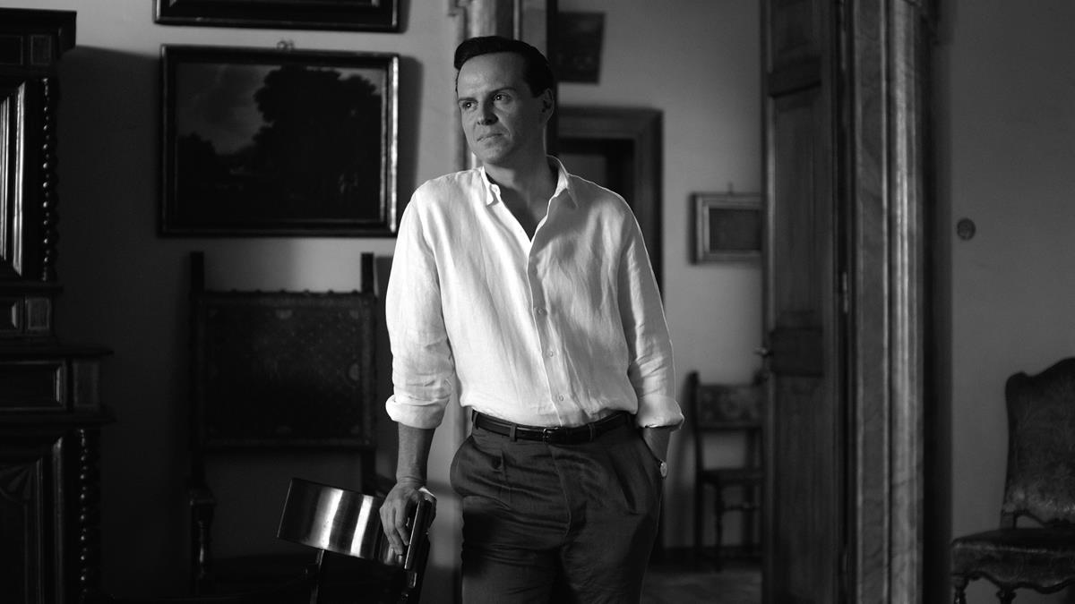
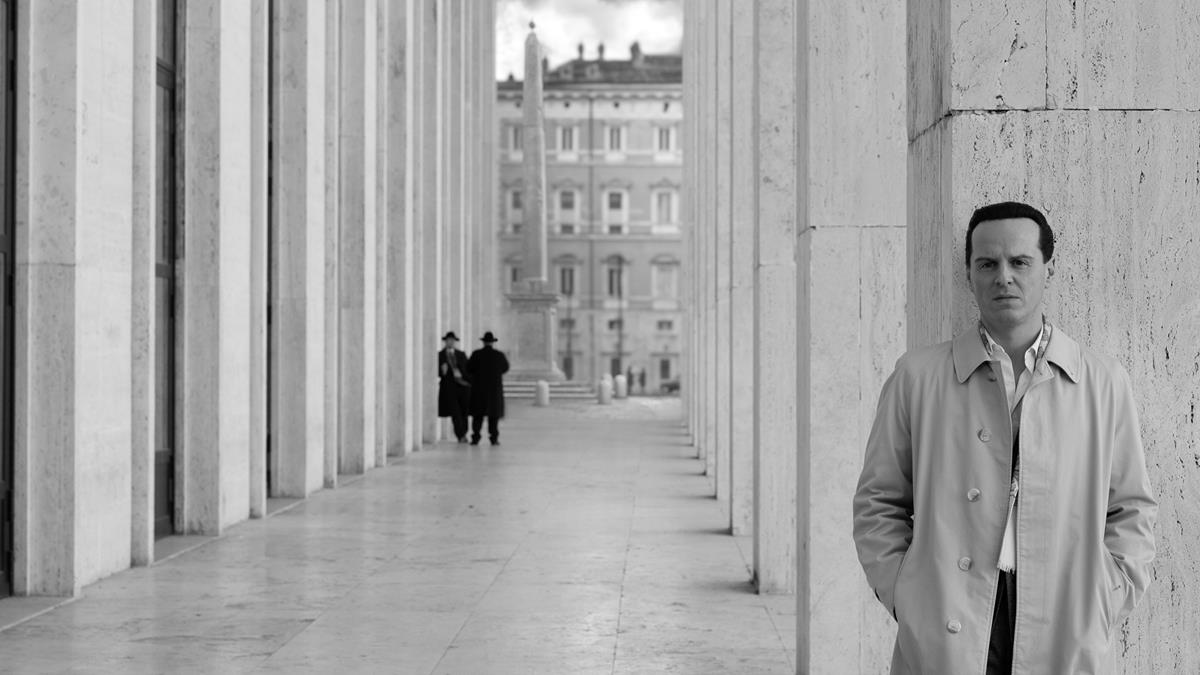
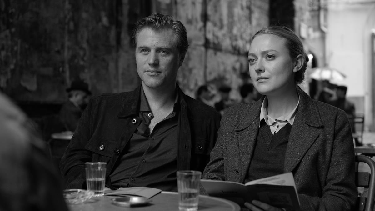
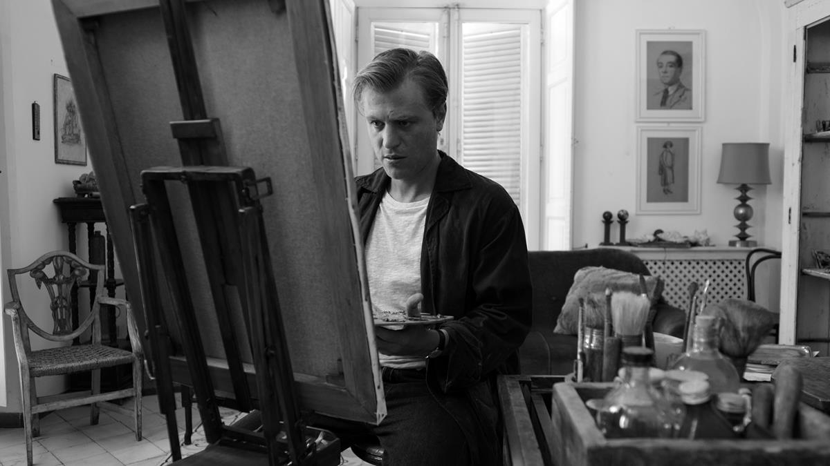
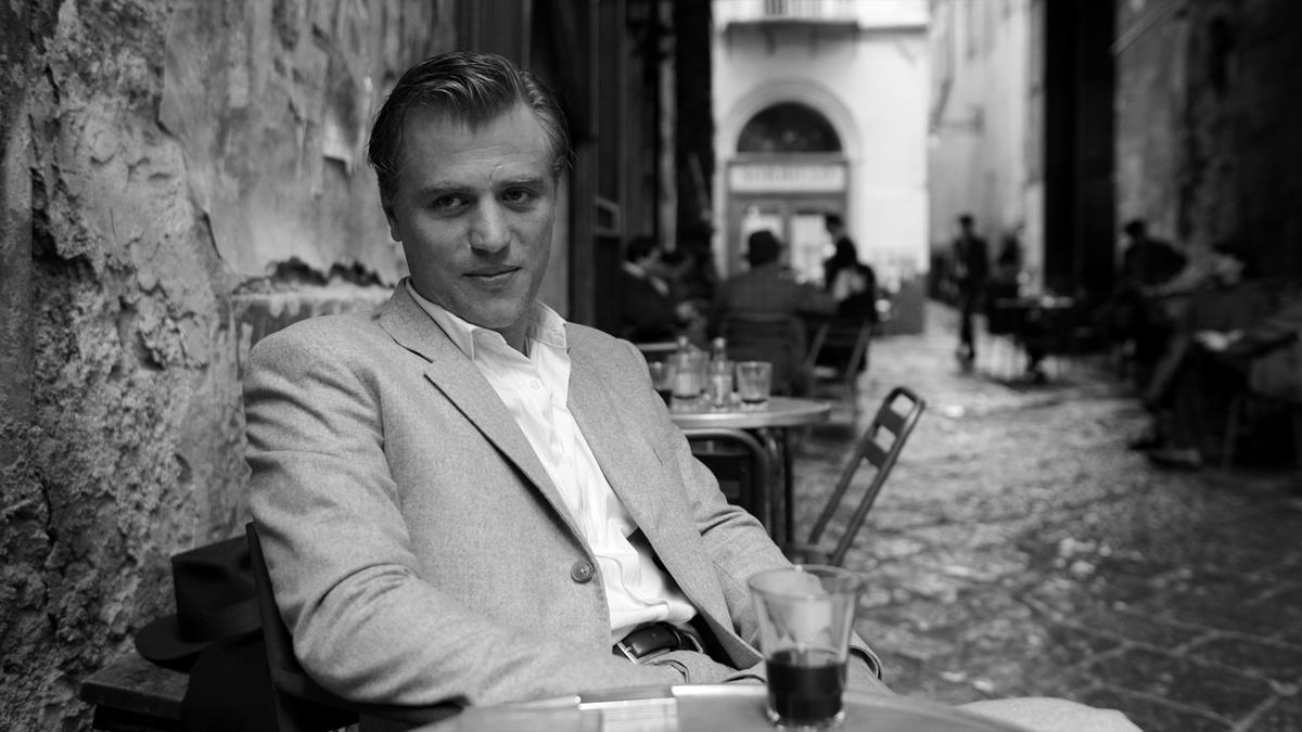
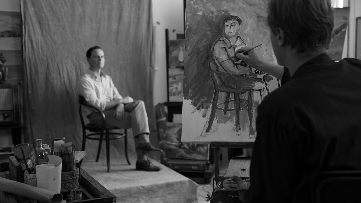
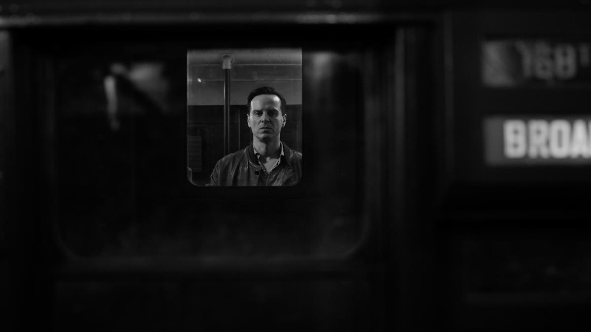
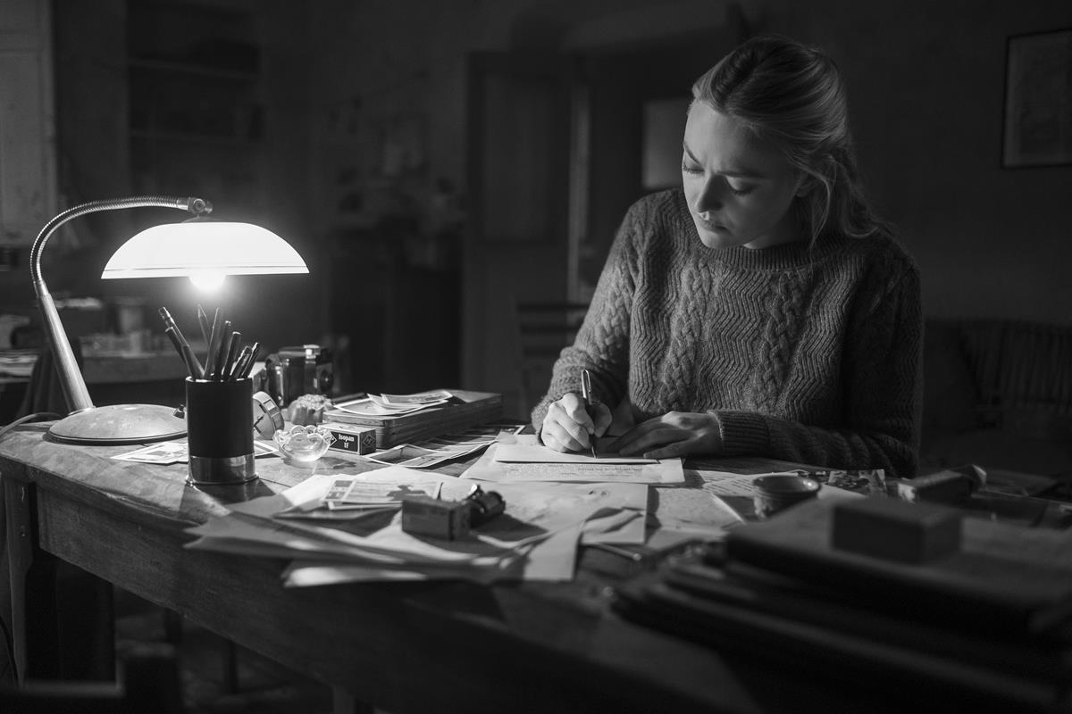
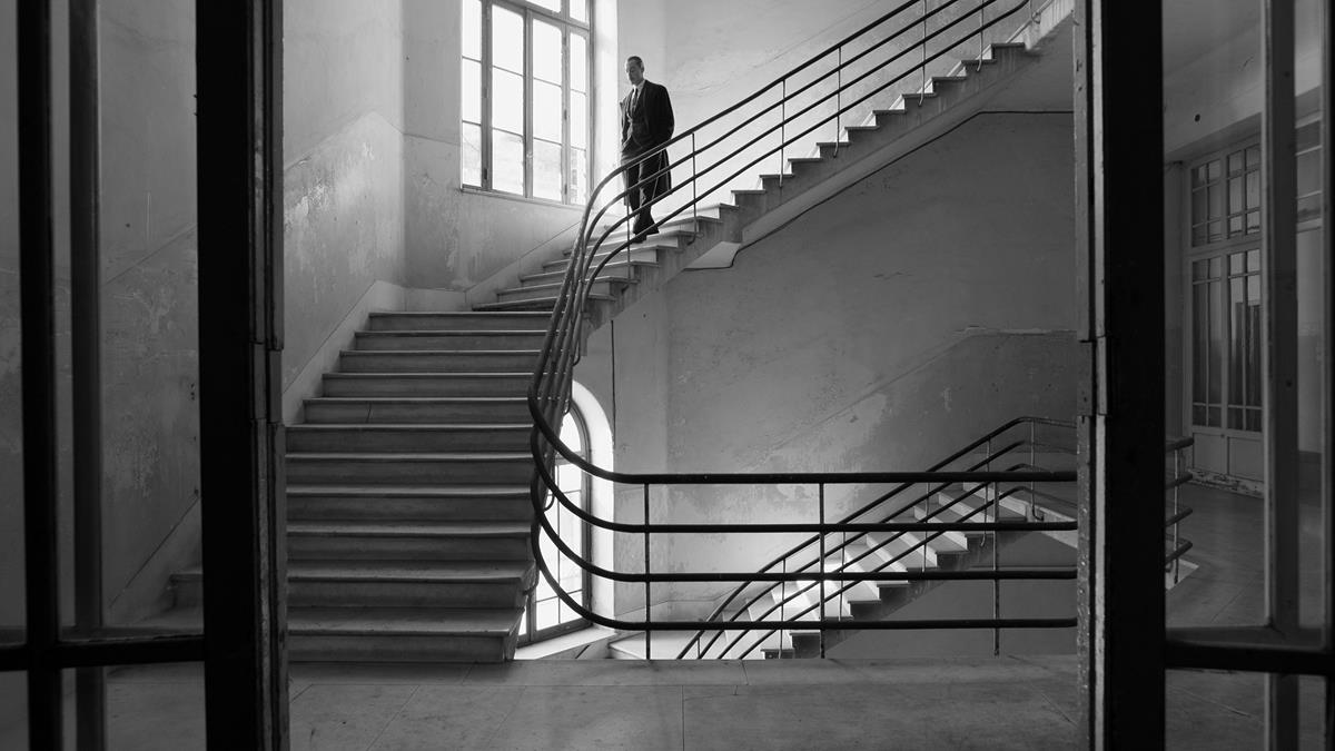
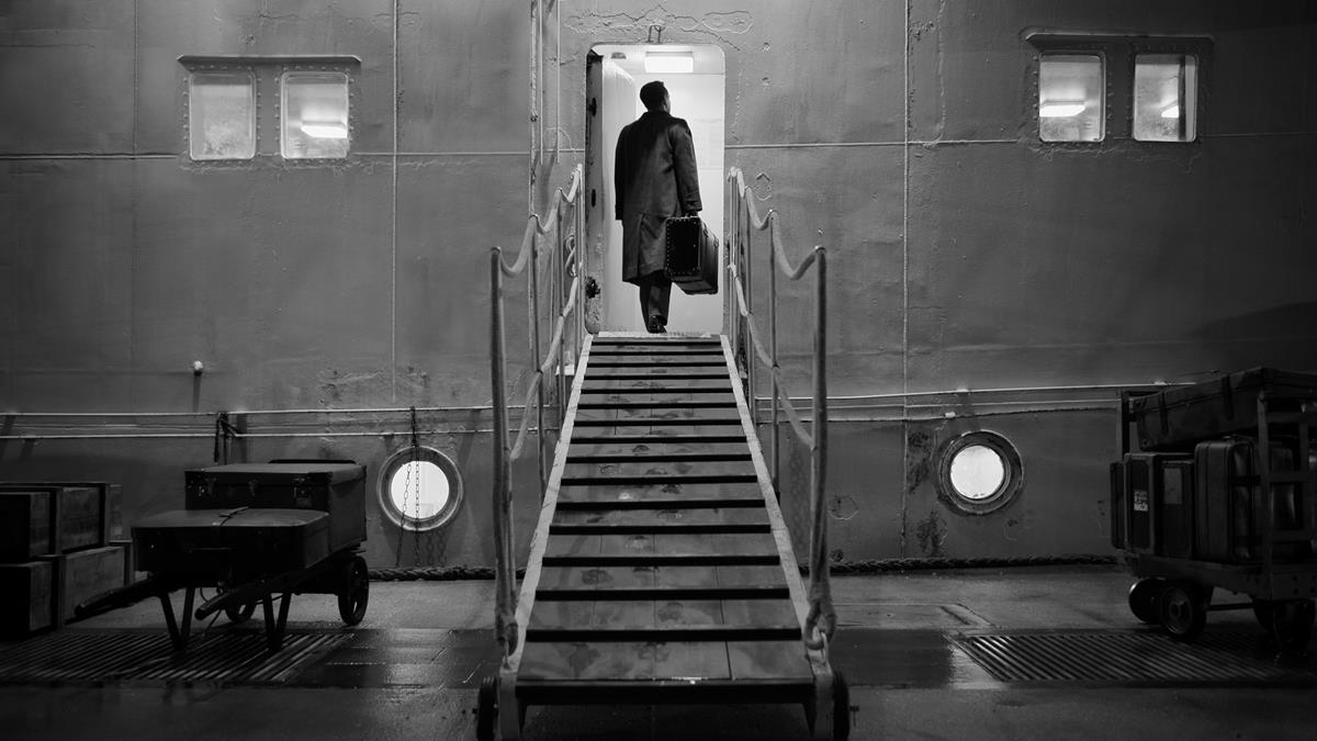
“When we had a chance we, tried to create a kind of chiaroscuro, a feeling of very strong shadows and very strong highlights,” Elswit explains. “I kept thinking while we were shooting, ‘I’ll fix all this later.’ And we didn’t fix any of it.”
Ripley leans into the noir of the original story in a more literal way than the 1999 feature adaptation starring Matt Damon. “What follows is a dizzying saga of lust, murder, impersonation, and deception, all captured in radiant black-and-white,” says Canfield.
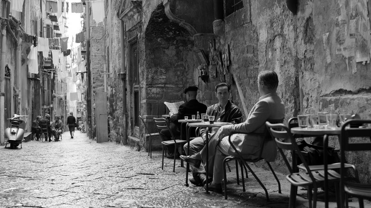
The story is set in Italy, including in Naples and the Amalfi Coast, and the locations were a key part of the look of the 1999 movie.
“I knew from the beginning that I wanted to have this high contrast film-noir style,” Zaillian says. “We didn’t want to do anything that was familiar to us… I didn’t want to make a pretty travelogue.”
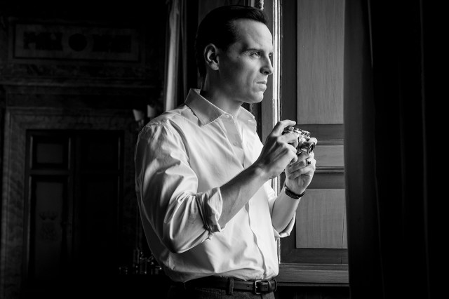
Elswit says that lead actor Andrew Scott has such an expressive face, “it dominates the series in a way. In all the different lighting setups where we did medium close-ups and tight close-ups, it was always fun to find an interesting way of creating contrast and shadows on his face.”
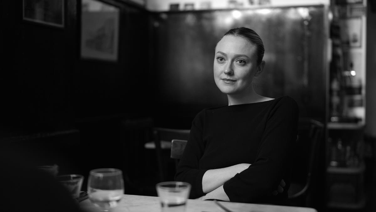
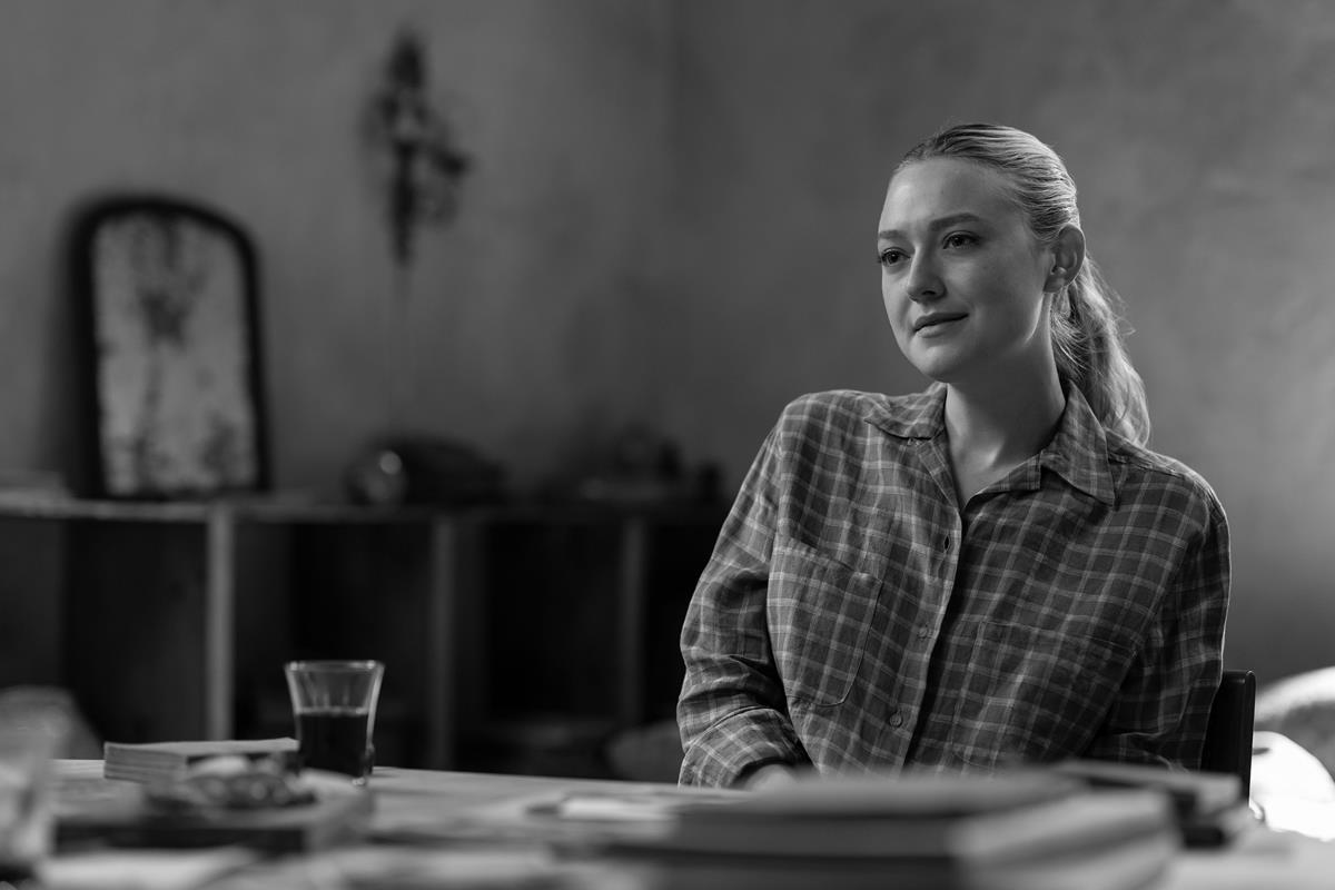
For lighting co-star Dakota Fanning, photographs of Grace Kelly served as inspiration. “It’s this hot, bright contrast between light and dark,” Elswit explains of one shot of her in a police station.
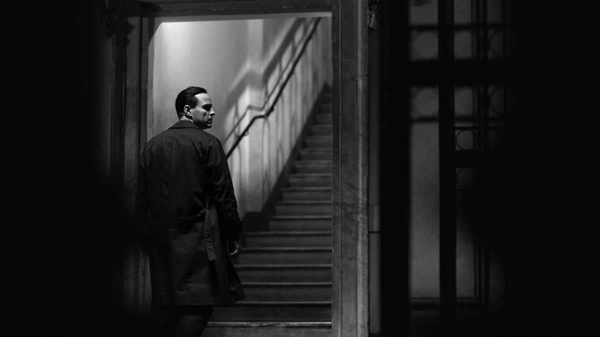
A lot of the show’s action takes place in an elevator. “It’s a symbol of dread for Tom Ripley when people come up in this elevator,” Zaillian says. “It’s a very important location for us. We shot it, basically, every way you could; from inside, from outside, from low, from high. But I had something very specific in my mind. We reached a point where we I started to see ways of shooting this location in a way that could be really fascinating, with this open staircase.”
Other classic noir lighting shots included looming giant shadows cast onto a wall, recalling Orson Welles’ entrance into the film The Third Man.
They used half lighting to evoke the idea that Ripley is two people almost all the time. In other shots Ripley is in total silhouette: “You know exactly what he’s thinking without seeing his eyes,” Zaillian says.
They also used the texture of buildings and cobblestones in ways that have been done since the 1920s. Zaillian added, “It doesn’t look nearly as interesting, by the way, in color, it just doesn’t.”
READ MORE: Inside the Stunning, Devious Cinematography of Netflix’s Ripley (Vanity Fair)
“In the series’ stark color scheme, the bloody damage Scott inflicts on these men and the lonely locations in which he abandons their bodies make both Ripley the character and this portrait of his ascension feel like Patricia Highsmith’s text filtered through a German Expressionist fever dream,” writes Vulture culture critic Roxana Hadadi.
She observes, “Shadows and darkness are more intriguing to Zaillian than sunny beach weather, which rarely shows up in Ripley, though it defines the look of previous adaptations. But maybe only a director who would confess to hating blue skies is capable of appropriately forefronting the murk of Tom Ripley.”
Zaillian told Hadadi that while Ripley’s genre and subject matter clearly influenced the cinematography, he also wanted to avoid having “it look like a postcard.” He said, “We shot in the winter; the whole story takes place in the winter. I didn’t want blue skies; I wanted cloudy skies, rain and rain-glistening streets. I had that look in mind from the beginning.”
To emphasize that contrast, the production team would soak the streets when shooting outdoors, Zaillian told Hadadi, explaining that technique “instantly brings those film-noir images to mind. And because it’s beautiful; it’s a little better than a dry street.”
READ MORE: ‘I Hate Clear Blue Skies’ Why Steven Zaillian brought a monstrous, black-and white version of The Talented Mr. Ripley to Netflix (Vulture)
Elswit told Definition’s Nicola Foley that he was initially worried that Zallian’s vision might be off-putting for viewers. However, the director won him over by explaining that the show’s high-contrast monochrome “is a correlative to the emotional side. Steve wanted the audience to feel the tension and unease of the world that Ripley moved in – and he felt that the images would evoke this.”
Removing color from his toolkit heightened the importance of lighting for Elswit. He explains, “If you are painting someone in open and direct sunlight, you’re making an emotional statement about your sense of who they are. And that carries over into monochrome more than in color.”
Foley notes that “light reveals truths about the characters and their inner worlds” in this series. Marge is the only fully lit character, while ambiguous Dickie lives in the penumbra and Ripley is fully shaded.
The quality of the light was also key to achieving the right effect. Elswit said, “[W]e wanted hard light – something that didn’t look that real, the way films were lit 60, 70 years ago.” That meant LED panels were largely out for this production, instead deploying fresnel lenses and HMIs. Tungsten lighting offered “a unique contrast” and is well suited to black and white, per Foley.
For lensing, Elswit turned to Panavision VA primes, Primo 70s and Utra Speeds. These offered modern conveniences combined with “predictable aberrations” to add character to the series’ aesthetic. He said these lenses “imitate the look of classic movies” while offering excellent focus, speedy apertures and consistency.
To achieve the right emotional distance, Elswit said, “[E]verything is wide lenses and mostly close-ups or medium close-ups or 40s.”
He explained, “We tried to make sure the lens choices and how we frame things worked as a complementary version to all these different spaces and buildings around us.” They also leveraged the architecture and atypical angles to realize “an air of voyeurism.”
READ MORE: This Charming Man (Definition)
In another article for Vulture, Hadadi writes that by rejecting traditional American conceptions of Italy, the Netflix version of Ripley “becomes of the most conceptual, visually uncompromising TV shows of the year.”
She notes that this iteration “of Ripley is fascinated with the 16th-century Italian Baroque painter Caravaggio, so famed for his use of contrasting light and dark that he spawned stylistic acolytes termed the Caravaggisti.” His obsession is then translated into the series’ visuals in fascinating and gorgeous ways.
Spoiler alert: “Yes, Ripley is in black-and-white. But its gradients are so rich and deep, you can easily imagine the garnet-maroon-scarlet-sangria-rust shades of blood gushing out of Dickie’s and Freddie’s bodies, washed away by Tom in his sink or discarded in his bathtub, and — in the series’ most jarring shot, a rare instance of color — tracked around his apartment building by the cat who knows what Tom’s been up to,” Hadadi points out.
In another callout to a trope of Italian artistry, she says Zaillian’s Ripley “is also inundated with religious imagery, and there’s a delightfully macabre quality to how Freddie’s body falls with his arms outstretched as if he’s Christ on the cross, a sacrifice Tom has to make to become his desired self.”
READ MORE: 37 Ripley Shots That Would Blow Caravaggio’s Mind (Vulture)
Why subscribe to The Angle?
Exclusive Insights: Get editorial roundups of the cutting-edge content that matters most.
Behind-the-Scenes Access: Peek behind the curtain with in-depth Q&As featuring industry experts and thought leaders.
Unparalleled Access: NAB Amplify is your digital hub for technology, trends, and insights unavailable anywhere else.
Join a community of professionals who are as passionate about the future of film, television, and digital storytelling as you are. Subscribe to The Angle today!


