TL;DR
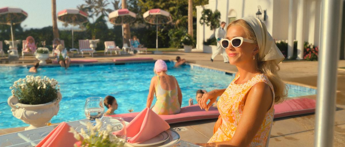
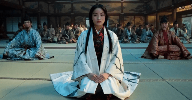
- Now streaming on Apple TV+, “Palm Royale” transports viewers to the opulent world of 1960s Palm Beach with visuals inspired by iconic photographer Slim Aarons.
- Creator and showrunner Abe Sylvia aimed to subvert the escapist humor of the series, which stars Kristen Wiig, with a critical look at class structures and the pursuit of status.
- Cinematographer Todd McMullen aimed to capture as much of “the vibe and the tone” of the series as possible in-camera.
- Unable to secure anamorphic lenses, McMullen opted instead for Panaspeed spherical primes outfitted with an astigmatiser, which became central to setting the show’s lush visual style and vibrant pastel color palette.
- Company 3 colorist Siggy Ferstl created custom LUTs for the series in collaboration with cinematographer David Lanzenberg, who also shot two of the 10 episodes.
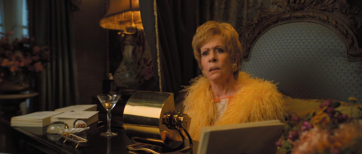
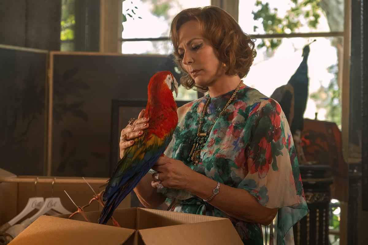
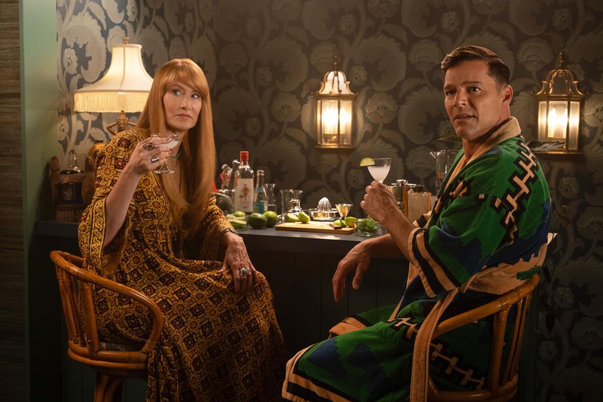
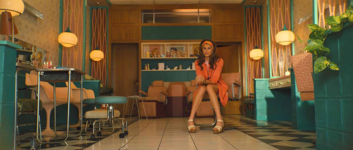
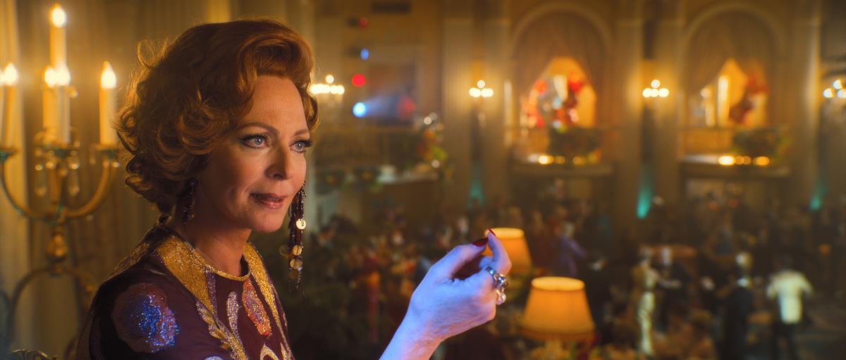
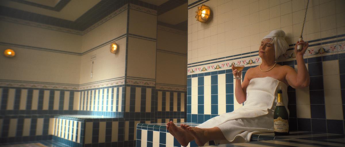
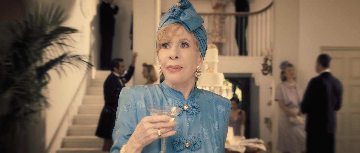
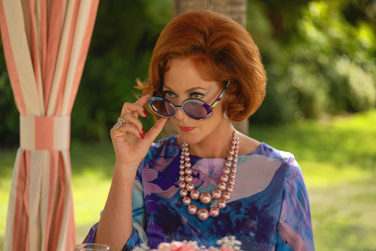
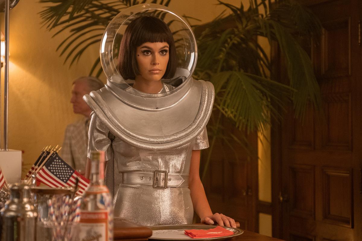
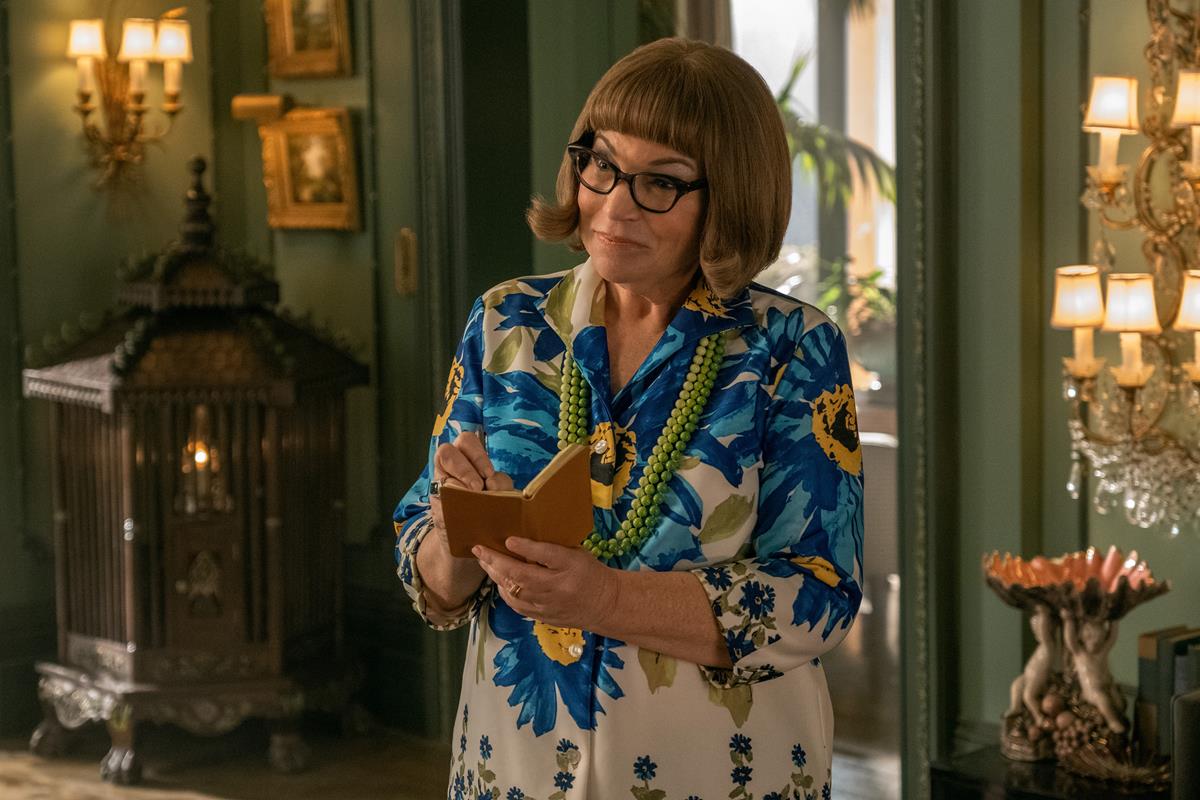
Palm Royale, the new series from Apple TV+ set in 1969 Palm Beach, Florida, has it all. Lavish resort settings featuring stunning period interiors soaked in vintage glamour, and a stellar cast, led by Kristen Wiig as Maxine Simmons, a relentlessly peppy anti-hero eager to climb into the inner circles of Palm Beach’s elite.
Maxine is filled with complexity, and the show delves into the hidden motivations and vulnerabilities of the high society figures she interacts with. A humorous yet biting look at class structures, the pursuit of status, and the blurred lines between reinvention and deception, Palm Royale examines the art of social climbing with equal parts hilarity and heart against a backdrop of wealth disparity, the secrets of the privileged, and the lengths people will go to belong.
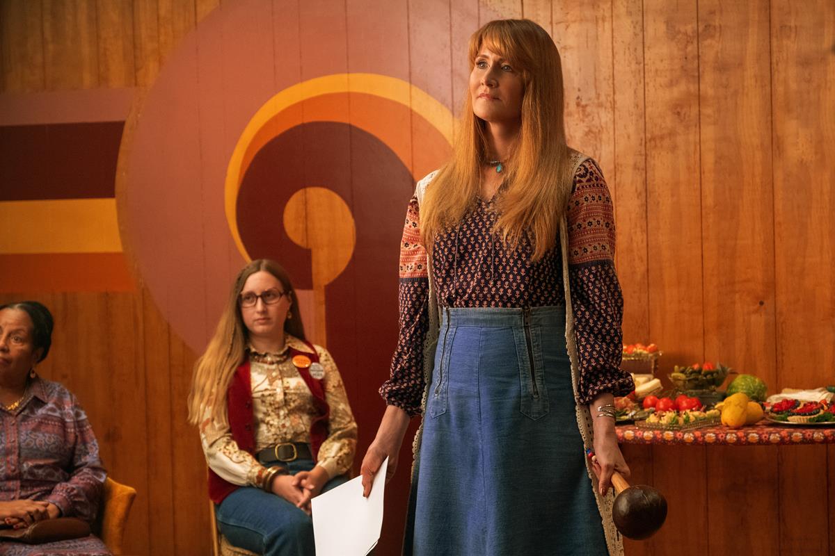
Based on the novel Mr. & Mrs. American Pie by Juliet McDaniel, the dramatic comedy series delivers a mix of sharp satire, humor and moments of poignancy that will have you rooting for its protagonist. It was created by Abe Sylvia (Dead to Me, The Eyes of Tammy Faye) and alongside Wiig includes Allison Janney, Laura Dern, Julia Duffy Ricky Martin, Josh Lucas, Leslie Bibb and more, including the legendary Carol Burnett, who manages to steal every single scene she’s in, even while literally in coma.
Yet the showrunner wanted to avoid serving up merely escapist humor, he tells TheWrap’s Loree Seitz, “without examining the true cost of the extravagance.”
Sylvia explains, “I don’t want escapism for escapism sake, so I found ways to subvert that at every turn. I wanted to make a show that was a delight to watch — that doesn’t mean it doesn’t have deeper implications, or it isn’t a metaphor for larger social anxieties that are going on. It’s still a frothy good time, even as you’re asking bigger questions.”
The work of iconic American photographer Slim Aarons inspired the visual style of the series, “to spotlight the ‘beautiful tension’ between the laid-back lives of 1970s Palm Springs socialites and the social upheaval just beyond their white picket fences,” Seitz writes.
“You have the emerging civil rights struggles and gay people at Stonewall in 1969, throwing that first brick, and yet, you look at these photos, and there’s no sense of that,” Sylvia told Seitz. “We all, as human beings in a world that’s going crazy, desire safety — we desire a beautiful world. We make ourselves intentionally deaf in order to be happy, but the real world will always creep in anyway.”
READ MORE: How ‘Palm Royale’ Delved Into 1960s Social Anxieties While Ensuring a ‘Frothy Good Time’ (TheWrap)
Despite its rarified milieu, Palm Royale remains entirely relatable, which Sylvia says he was able to achieve by finding the universal elements of the story.
“We may not all know what it’s like to go to a charity ball and spend $75,000 on a stone cat,” he tells Sadie Dean at Script Mag. “We’ve all done things in order to say I am here in our lives that we wish we could take back. It’s this smallness of our own sort of human curiosity really, that drives these very relatable actions that we all take — we’re all fools in our own lives. And I say that with love, we’re just all idiots on the bus trying to get through it. And my job and the writer’s job is to honor that and interrogate that and hold up a mirror to people. And do it lovingly and without judgment.”
READ MORE: Pathos and Character: An Interview with ‘Palm Royale’ Creator and Showrunner Abe Sylvia (Script Mag)
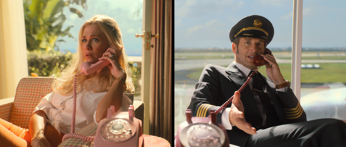
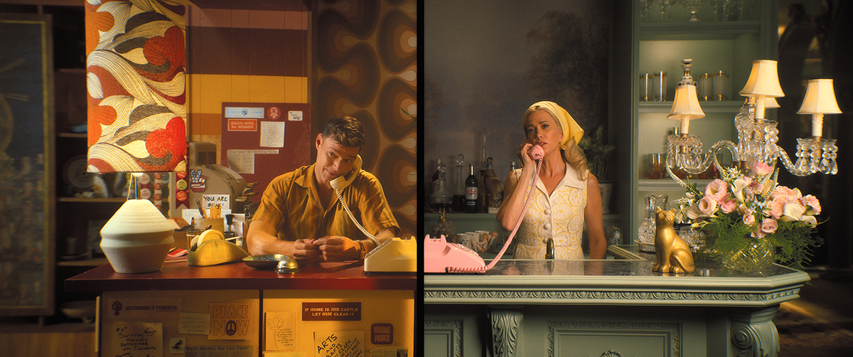
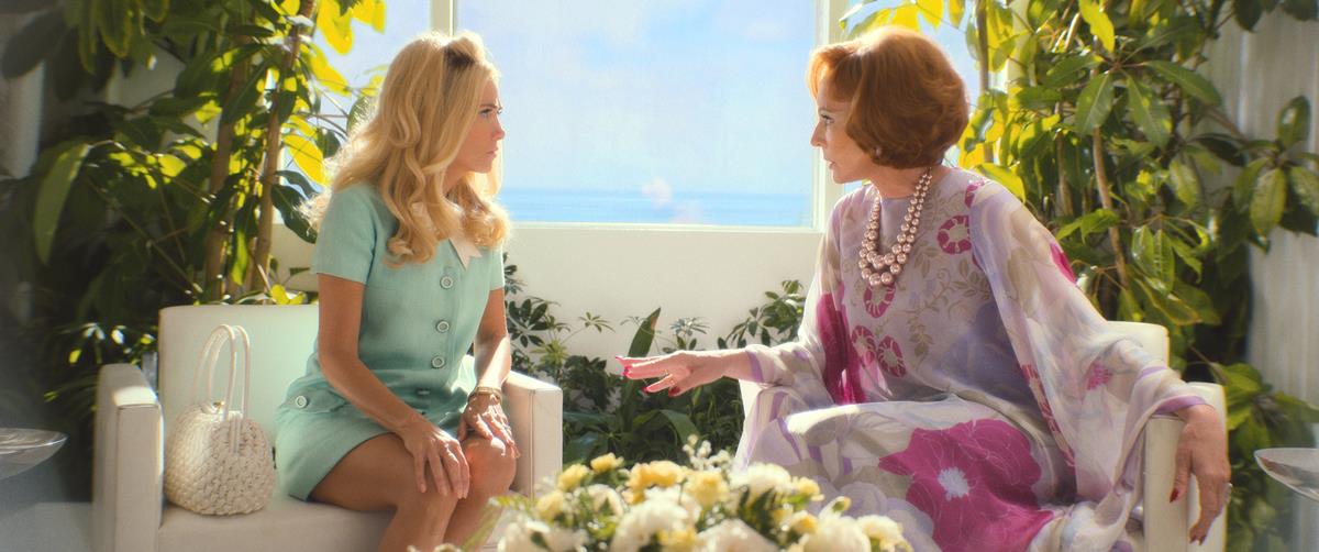
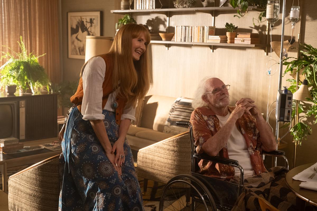
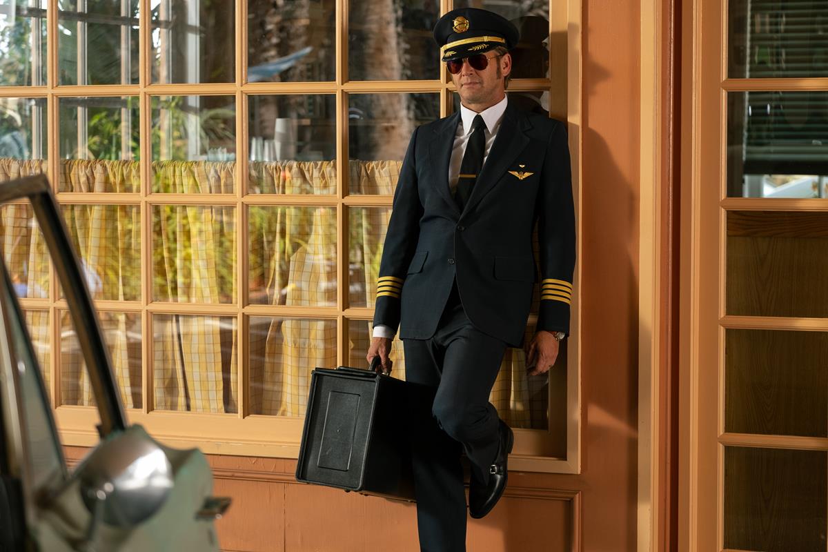
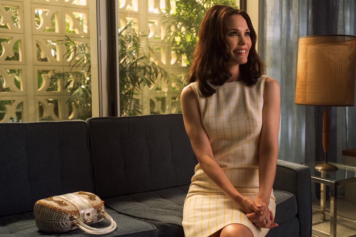
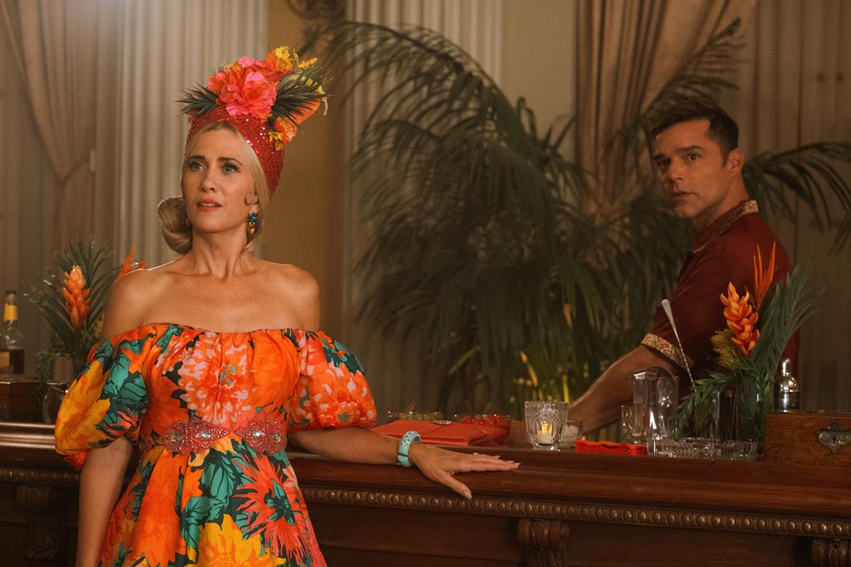
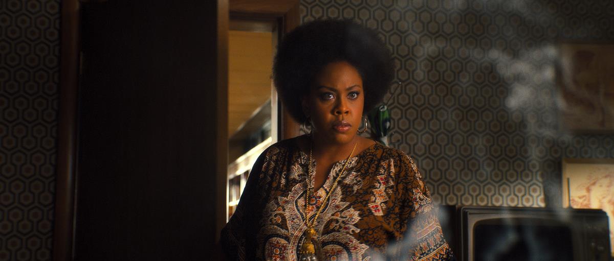
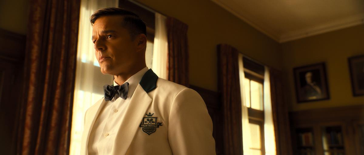
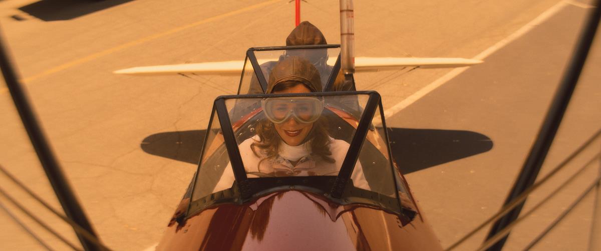
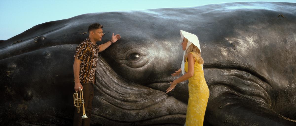
Shot on film in a nearly edible pastel color palette, the lush visuals capturing the fashion, style, and extravagance synonymous with 1960s Palm Beach were crafted by cinematographer Todd McMullen, who oversaw eight of the season’s 10 episodes and whose previous work includes The Newsroom and Santa Clarita Diet. This was supplemented by cinematographer David Lanzenberg (Riverdale, Chilling Adventures of Sabrina), who shot two episodes and was also instrumental in developing a video lookbook for the show.
“Long story short, we all came together to find the right ingredients to have the same look that we all wanted to make the show look like,” McMullen told Gordon Burkell at Filmmaker U, describing the collaboration. “So it was all mutual. And, you know, we all brought different ingredients to the creative team. And it just worked out great.”
Detailing his approach to filming Palm Royale, McMullen recalled his early discussions with series director Tate Taylor about the show’s cinematic scope and the theatrical look they wanted for it.
“Part of that was shooting on film, anamorphic,” he said. “You know, the 2.39 aspect ratio is what you would present in a theater. And so, we always wanted to use anamorphic lenses, which have the roll-off and some of the, you know, inconsistencies… with each lens.”
But the production wasn’t able to secure the anamorphic lenses McMullen wanted (“They’re in such demand, you know, and there’s so few of the good ones.”) so they opted instead to employ Panaspeed spherical primes outfitted with an astigmatiser for controlling the level of falloff. (“I think Robert Richardson uses it sometimes, too.”)
This combination, he says, “really worked well on some of the flashback scenes. And it was just absolutely gorgeous.”
While this look helped set the overall visual style of the series, “as we started going, we had to kind of scale a little bit of that down because it was becoming too, too much,” McMullen recounts. “So we found a nice mixture of that, for certain scenes and certain frames, that worked really well.”
McMullen aimed to capture as much of “the vibe and the tone” of the series as possible in-camera. “My goal once I got there, seeing how everything was built and designed, and the costumes and the hair, the makeup, the sets, I was like, ‘I can’t get in the way of this,’” he says. “I’m not gonna try anything, I’m just gonna put a great frame out there, a great lens, and it’s going to take care of itself, you know, because it’s so beautiful.”
Color grading was completed by Company 3 colorist Siggy Ferstl, who also serves as creative post council co-lead at CO3’s Santa Monica location.
“David had worked with Siggy before, and he had set that up, and they had worked on some LUTs that were really appropriate and beautiful,” he says of the process.
“So once I got in there with my stuff — I didn’t have a lot either, it might have been a few things — I’d say ‘Well, I tried to do this or that,’ but for the most part it was on the tracks and on its way.
“Siggy is so wonderful about the way that he works with those images,” McMullen adds. “I mean, working with pros is always a great thing.”
Next, Watch This:
Why subscribe to The Angle?
Exclusive Insights: Get editorial roundups of the cutting-edge content that matters most.
Behind-the-Scenes Access: Peek behind the curtain with in-depth Q&As featuring industry experts and thought leaders.
Unparalleled Access: NAB Amplify is your digital hub for technology, trends, and insights unavailable anywhere else.
Join a community of professionals who are as passionate about the future of film, television, and digital storytelling as you are. Subscribe to The Angle today!

