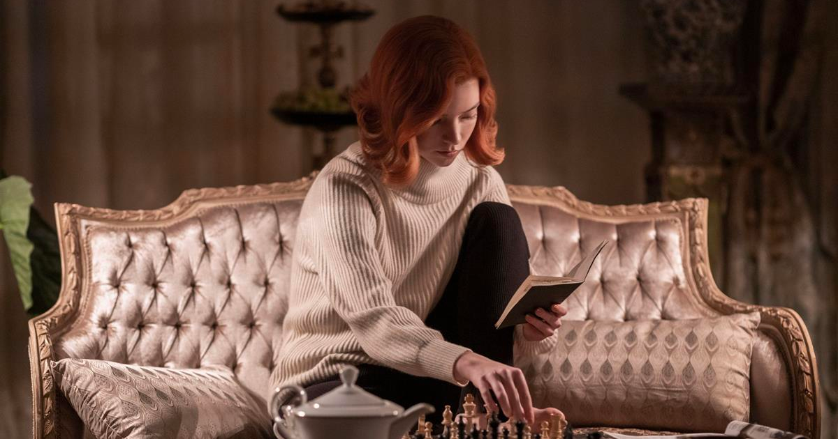
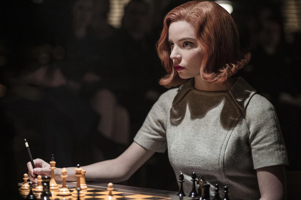
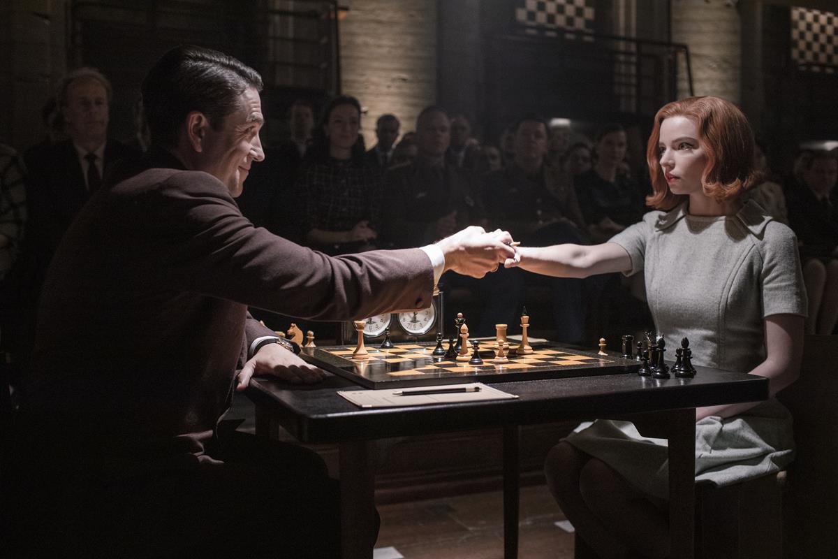
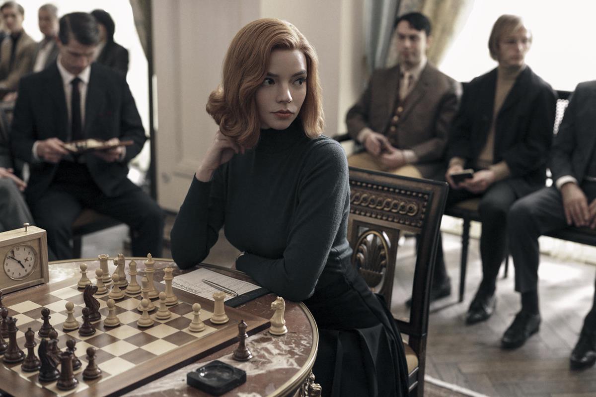
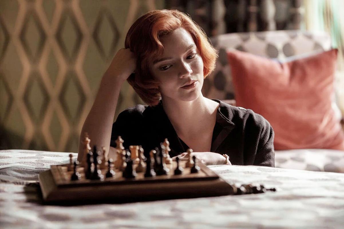
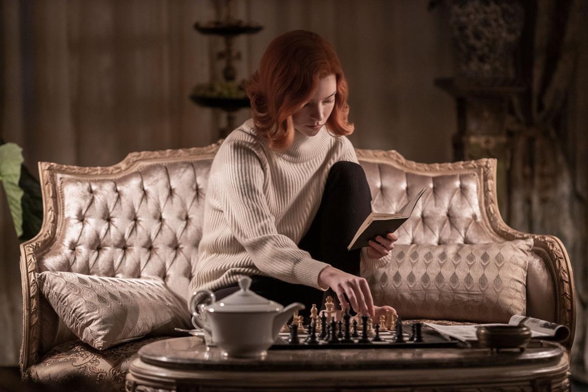
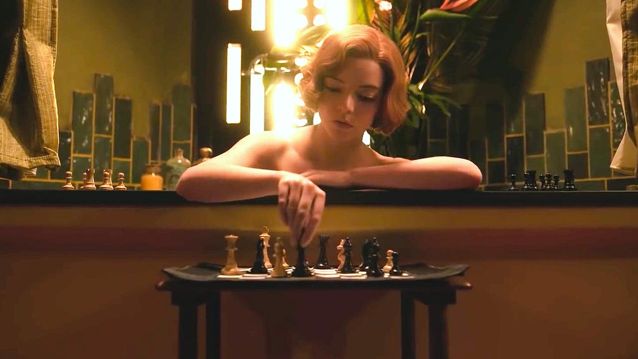
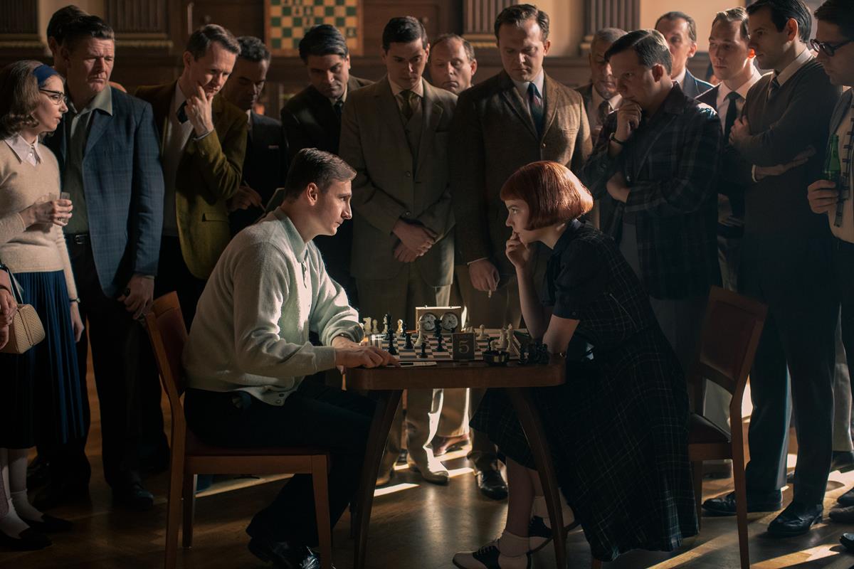
Now and then, it just so happens that I find a movie that visually amazes me. I was blown away by the colors of The Grand Budapest Hotel or by the cinematography of Birdman. The Queen’s Gambit, a series created by Scott Frank and Allan Scott, is one of those surprises that I have discovered recently.
Steven Meizler, the series’ director of photography, is quickly becoming one of my favorite cinematographers. I loved what he did with the Godless series and I have started to love his work more and more.
Source: Martin Kaninsky, PetaPixel
AT A GLANCE:
In a recent essay for PetaPixel, Martin Kaninsky of the About Photography Blog examines the composition techniques utilized by DP Steven Meizler on the Netflix series The Queen’s Gambit.
Kaninsky categorizes these techniques as Leading Lines, Symmetry, Patterns and Rhythm, Frames and Subframes, Negative Space, Depths and Layers, Close Ups and Portraits. The assessment is spot on as one can see example of all seven within the first few minutes of the first episode of the limited series.
Using clips from the show as well as diagrams and examples from still photography, Kaninsky wraps and artful frame around his breakdown of Meizler’s skillful use composition to guide the audience, build characters and move the plot forward.
“[W]hat both photography and cinematography have in common while using these techniques is that they force the viewer to focus strictly on your subject and help with the message of the shot,” says Kaninsky.
Head over to PetaPixel to read the full story.


